Formula 1 Data Visulization 2011-2024

PowerPoint
presentation
data analysis
Excel
Author

Me, Adrian Sayvongsa, Rachel Hudgins, Aiden MacKay

Published

December 8, 2025

Team members: Rachel Hudgins Aiden Mackay Adrian Sayvongsa Connor Gage

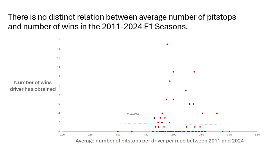
[Our group chose F1 racing data. We wanted to have an interesting dataset with years of data. The F1 racing data that we found contained 13 years worth of data from many different races breaking down Driver, Team, altitude, and any other factors that may have played a part in the ranking of the racers.] (datavis.jpg) Which constructor (team, essentially) overall has the most wins? This question was interesting to us because we wanted to see which team is running the show at Formula 1. Used the constructor_standings dataset and filtered it down to count only wins from 2011 onwards, and then used a pivot table of that data to see which constructorid was tied to which constructor, then created the bar graph from that. We created the chart by removing chart title and border, making the histogram red, and adding axis titles. Which constructor (team, essentially) overall has the most wins? This question was interesting to us because we wanted to see which team is running the show at Formula 1. Used the constructor_standings dataset and filtered it down to count only wins from 2011 onwards, and then used a pivot table of that data to see which constructorid was tied to which constructor, then created the bar graph from that. Is there a relation between average number of pit stops and number of wins? This was interesting to us because during a race a pit stop can make or break the race so we wanted to see if there was any correlation. We used a pivot table to collect average pitstops per race for every driver who raced in the 2011-2024 seasons, then found how many wins that driver had in the same seasons, then created the scatter chart based off of that. We created the chart by removing chart title, border, and gridlines, then making the points red, then adding axis titles and trendline/R^2 value. Have F1 pit stop times improved from 2011 through to 2024? We thought this was interesting because as we wanted to see whether in 10 years if pit stops can be even faster than what is already is. We Used the pit_stops dataset and created a line graph of every pitstop, filtering out every outlier by excluding all that lasted longer than Q3+(1.5*IQR) milliseconds. To create the chart we made the line red, removed border, gridlines, and chart title, and added axis titles.